
PRODUCT LAUNCH
Vanilla Bombshell
Role
Creative direction / Packaging / Brand identity
The Brief
Visual idenity and packaging for a signature perfume launch for model Olivia Arben, keeping the core idea intact while giving the fragrance a stronger, more refined identity.
The Outcome
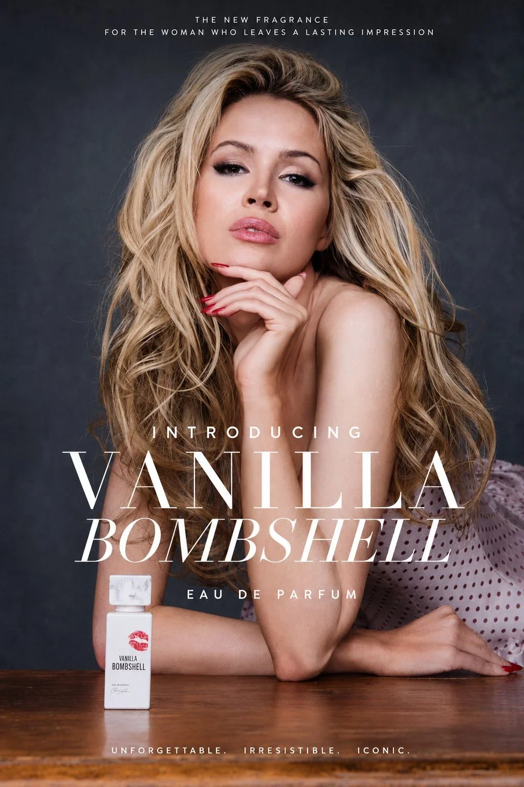
A bolder red-and-white identity centred around an expressive lipstick mark and Olivia's signature, later rolled out across the fragrance's launch marketing and outdoor advertising.

Evolving an existing idea into something bolder
THE STARTING POINT
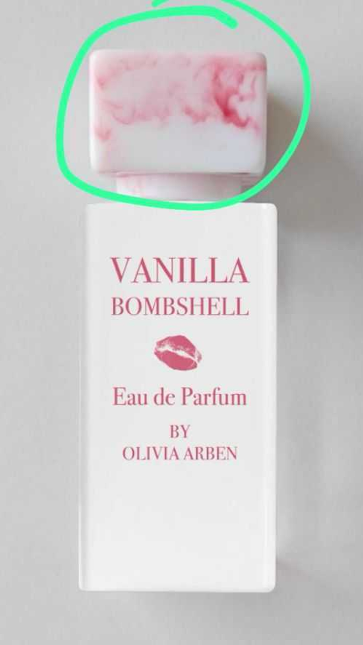
The redesign evolved Olivia Arben’s Vanilla Bombshell into a more distinctive identity while retaining the original bottle and cap. The aim was to keep the fragrance feminine and seductive, but give it more personality, impact and recognisability.
The lipstick mark felt worth retaining as a natural link to the “Bombshell” name, but it needed to feel less decorative and more iconic.
Art directions
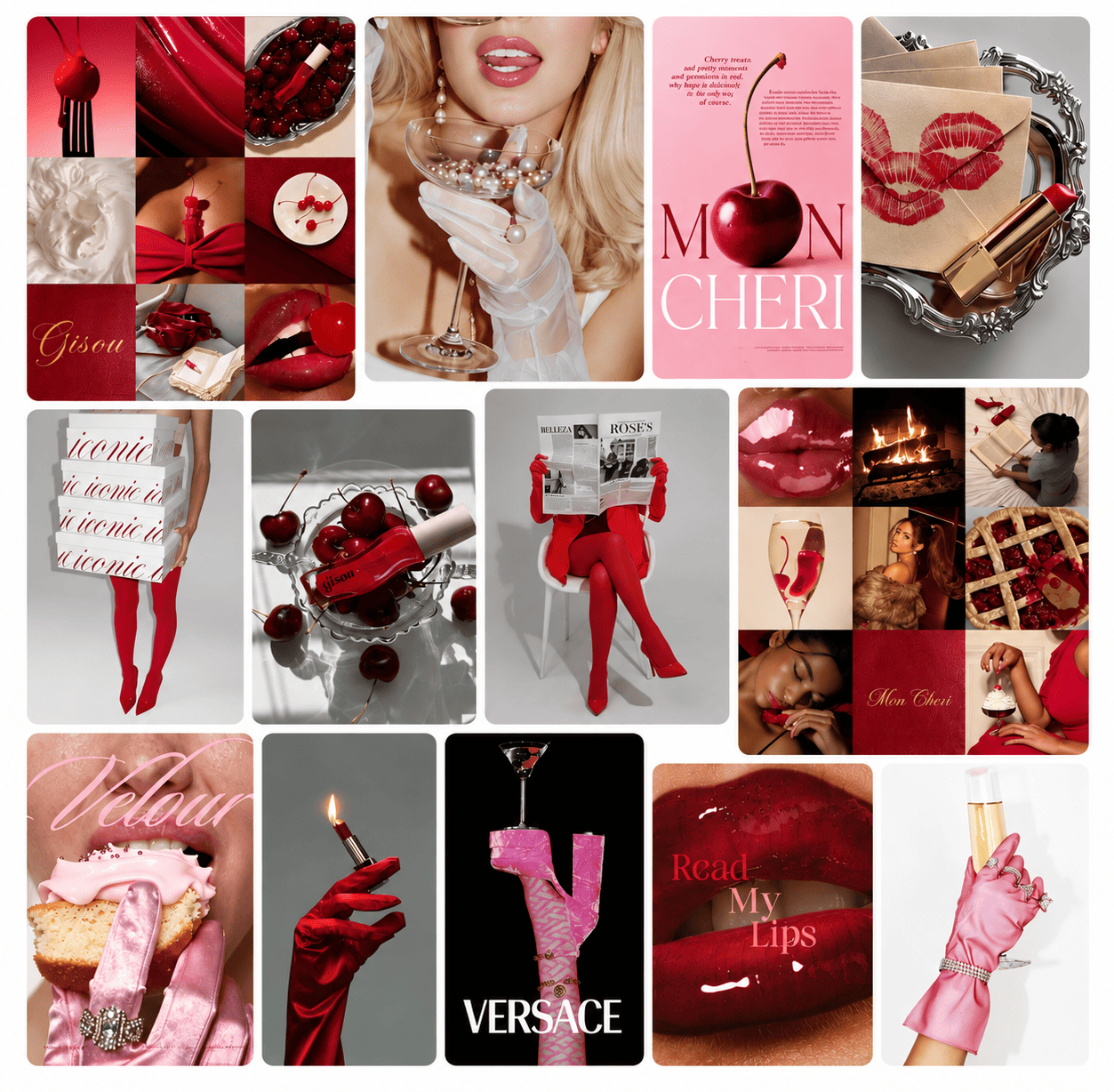
Bold Bombshell
Confident · Bold · Editorial · Seductive
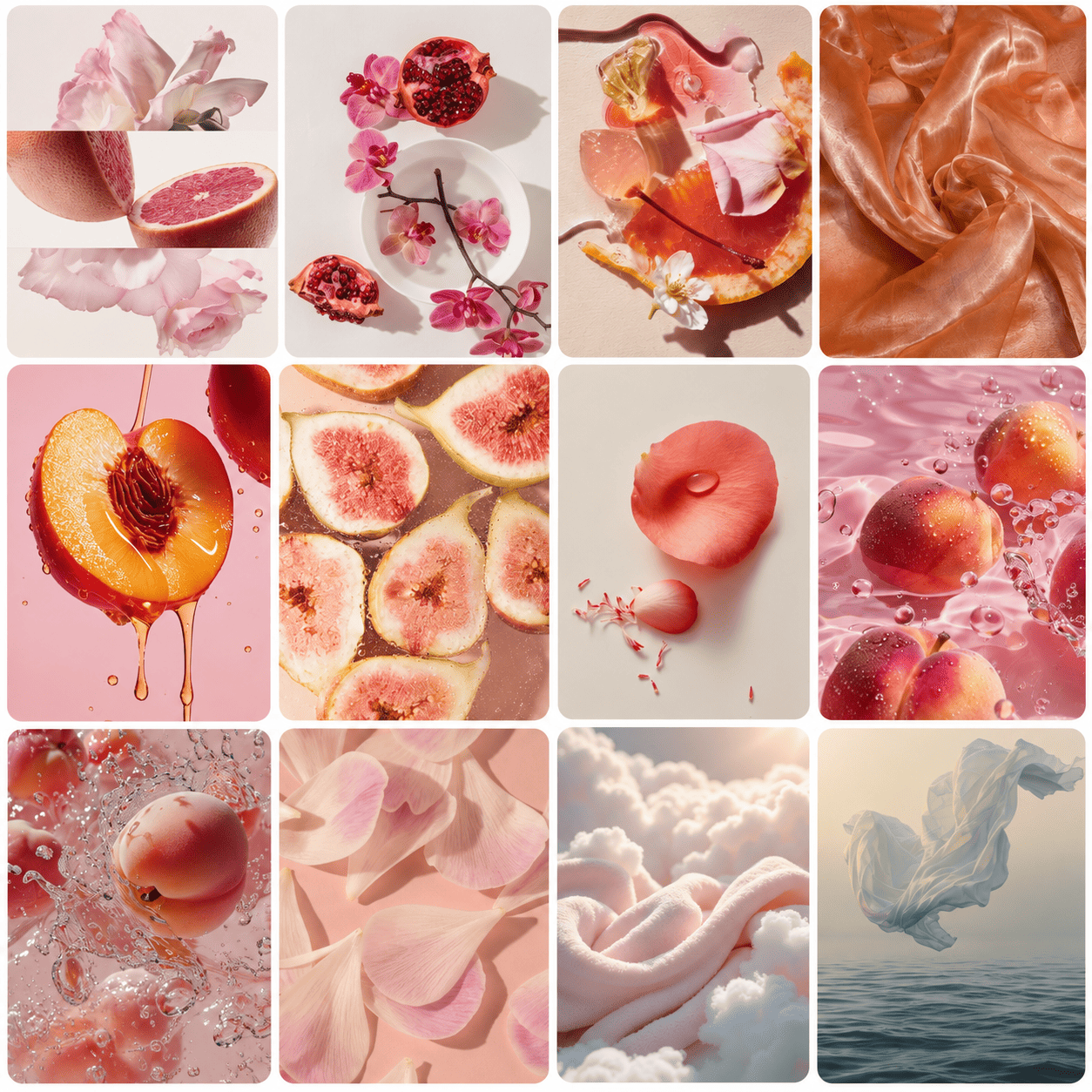
Whimsical Fantasy
Playful · Romantic · Dreamlike · Surrealism
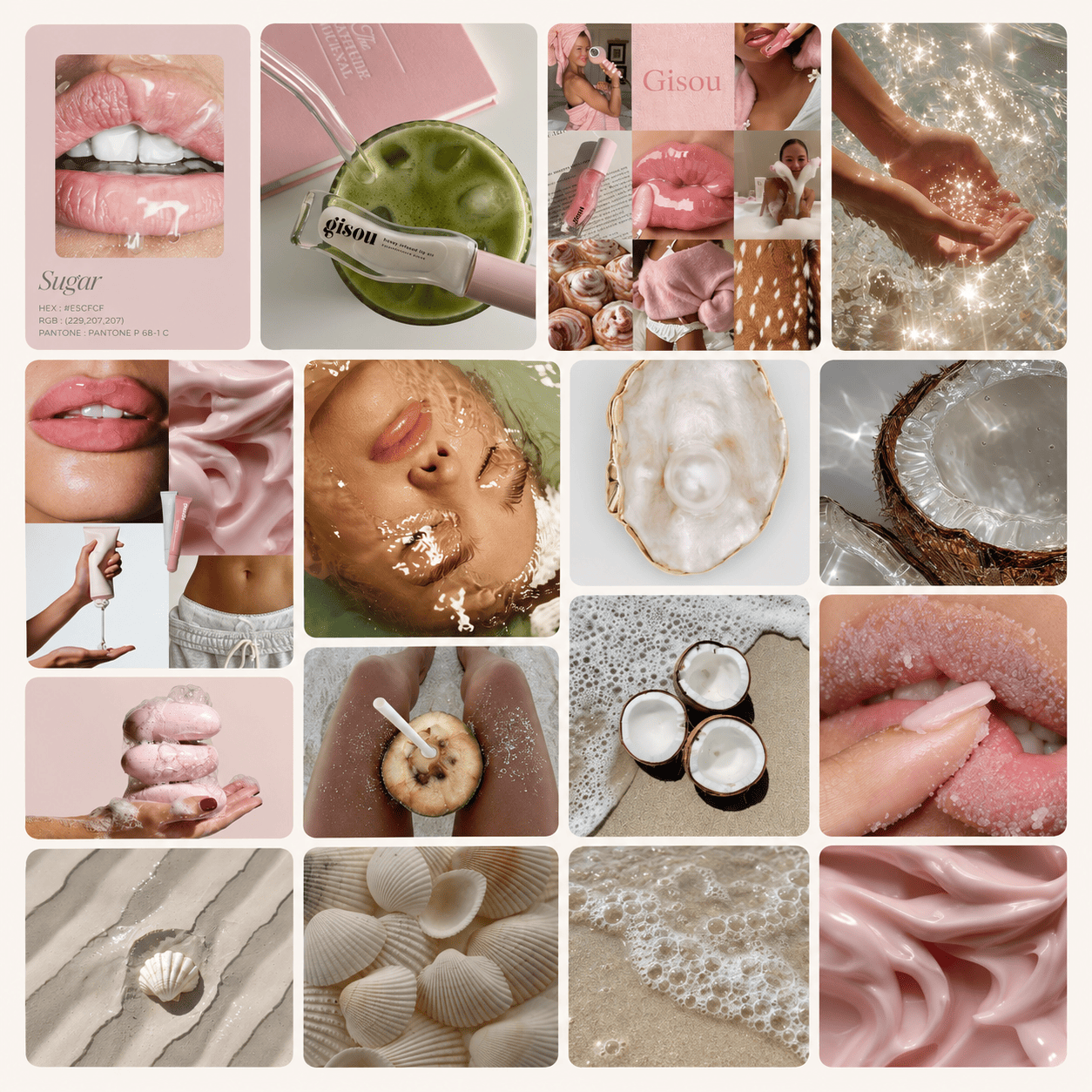
Coastal Clean
Fresh · Effortless · Polished · Feminine
VISUAL HOOK
Developing the signature lips
The original bottle already featured a lipstick mark, and it felt worth keeping as a recognisable link to the Bombshell name. I reworked it into a bolder, more textured version and Olivia signed off the direction early.

DESIGN EXPLORATION
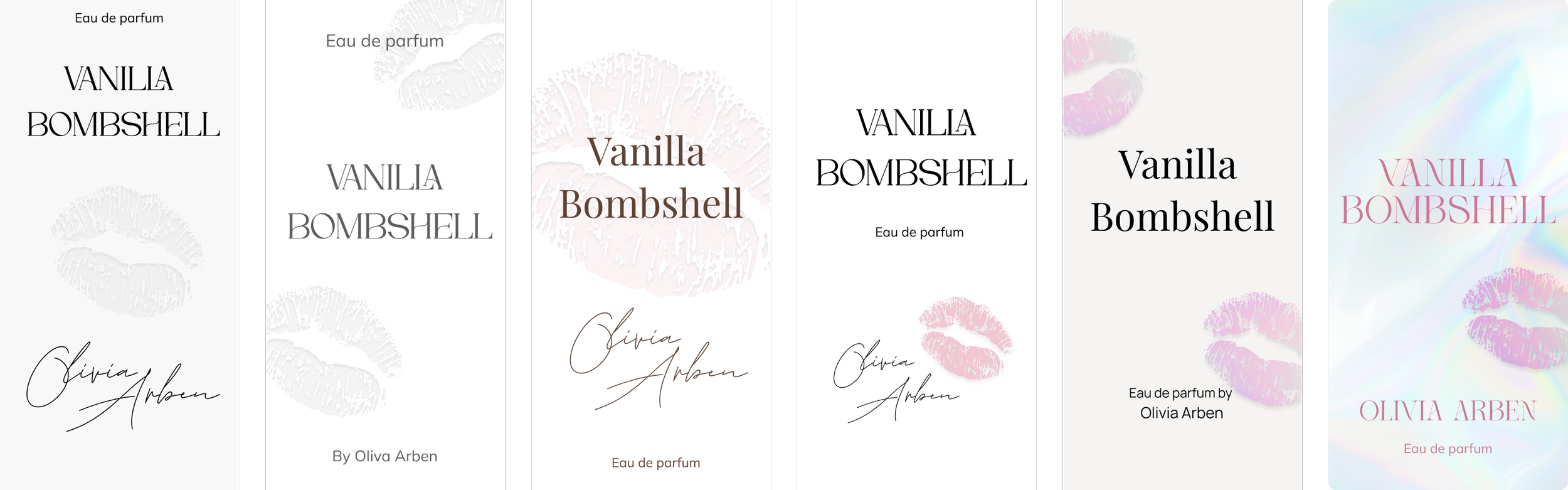
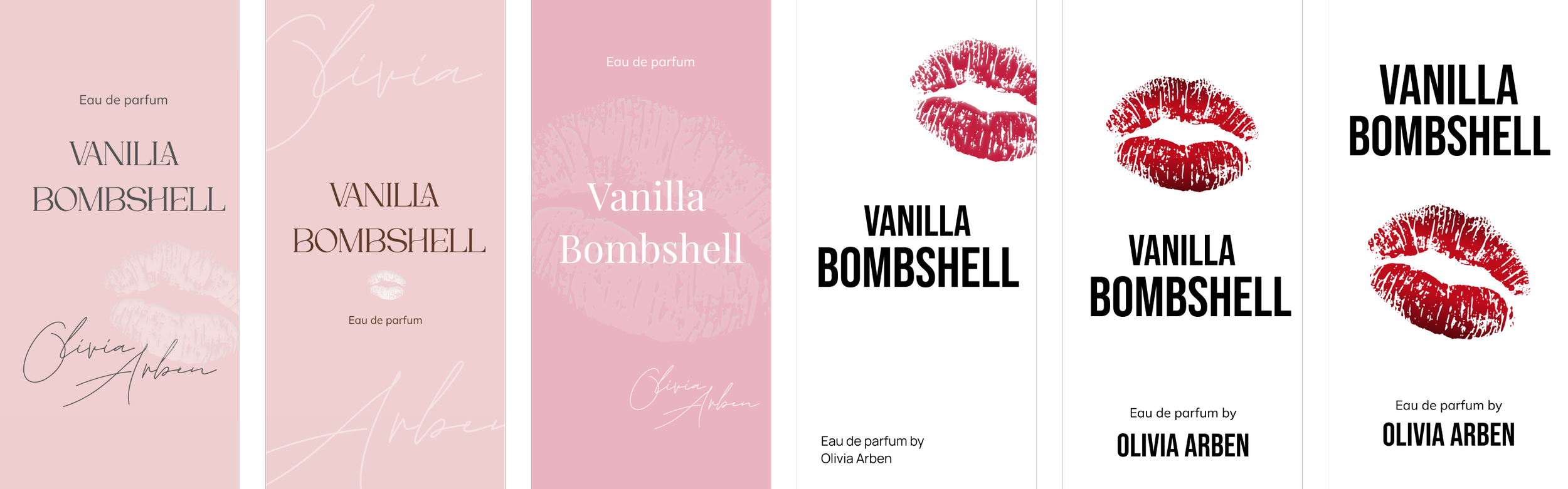
Turning each direction into a bottle
I translated the three territories into early packaging concepts, testing different palettes, typography, layouts and treatments of the lip motif.

A confident choice
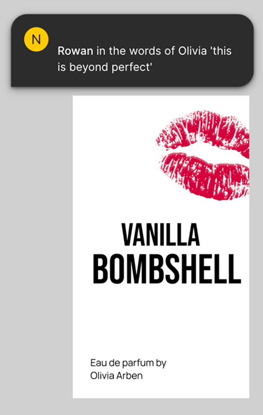
CHOSEN DIRECTION
Olivia immediately connected with the bold direction and signed off on the design quickly. She had also mentioned earlier that she liked the more personal feel of a script-style name, so I explored one final refinement using her signature before the final design was approved.
A personal finishing touch
PACKAGING
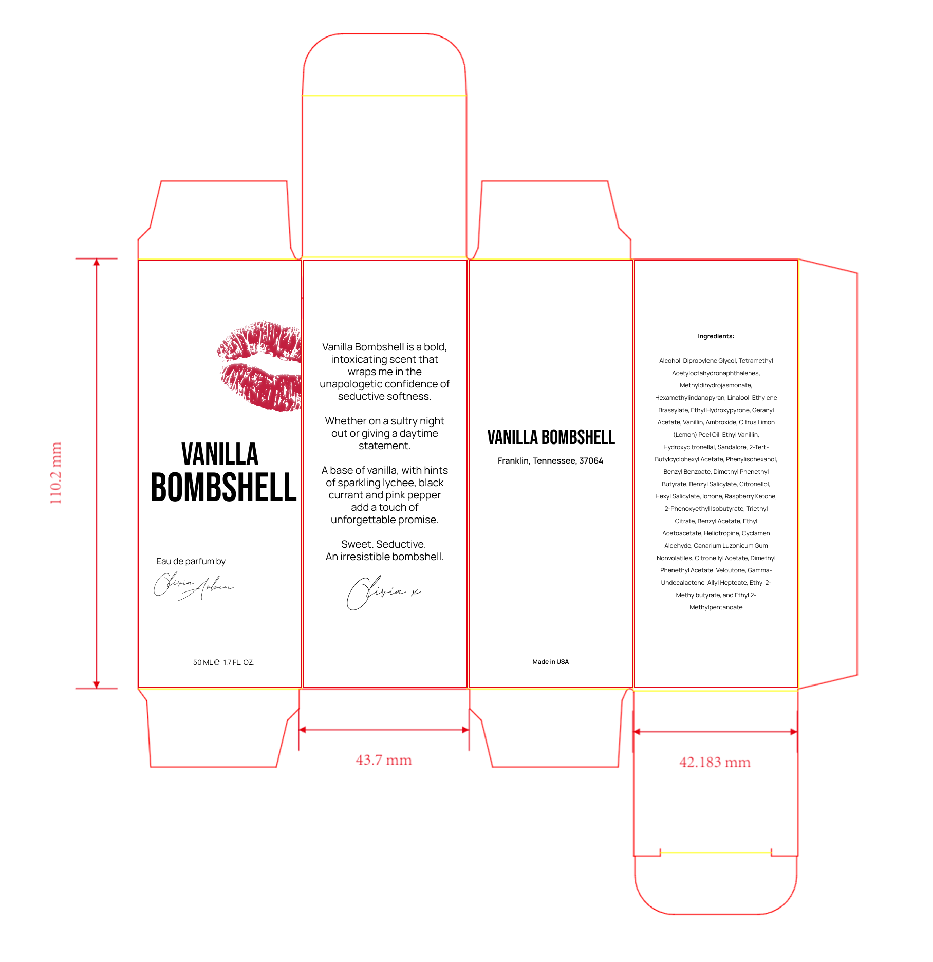
With the bottle direction signed off, I introduced Olivia’s signature as the final refinement, then carried the identity across the outer packaging to create a more complete and cohesive system.
The bold typography and lip motif stayed consistent, while the remaining panels were used for product details, ingredients and fragrance storytelling.
IN THE WILD
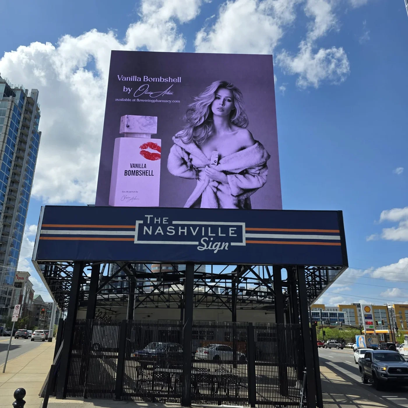
From Figma to Nashville
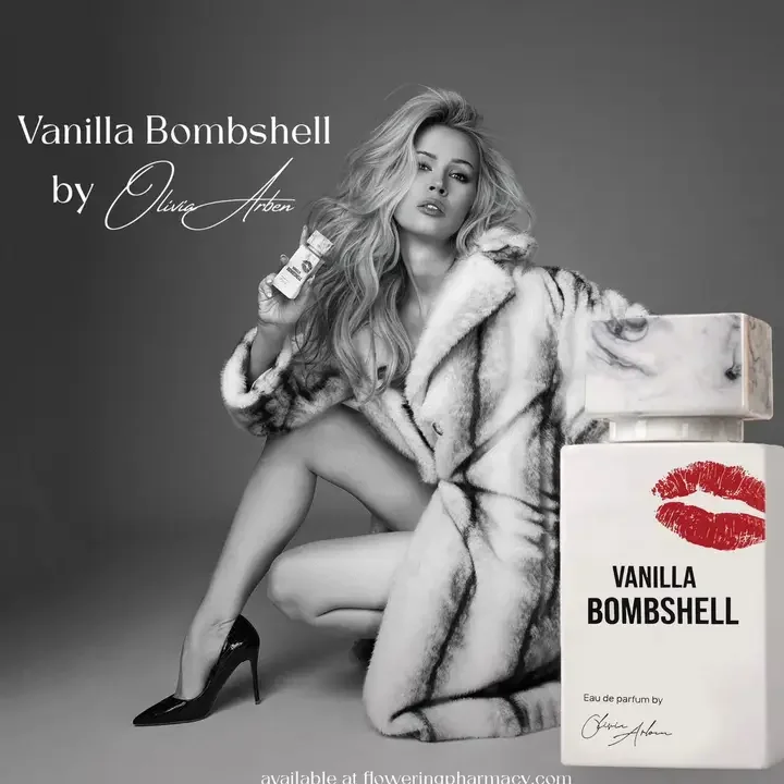
The final identity was then used across Olivia’s launch imagery and outdoor advertising, giving the new packaging a much stronger presence beyond the product itself.
FINAL OUTCOME
A stronger expression of Bombshell
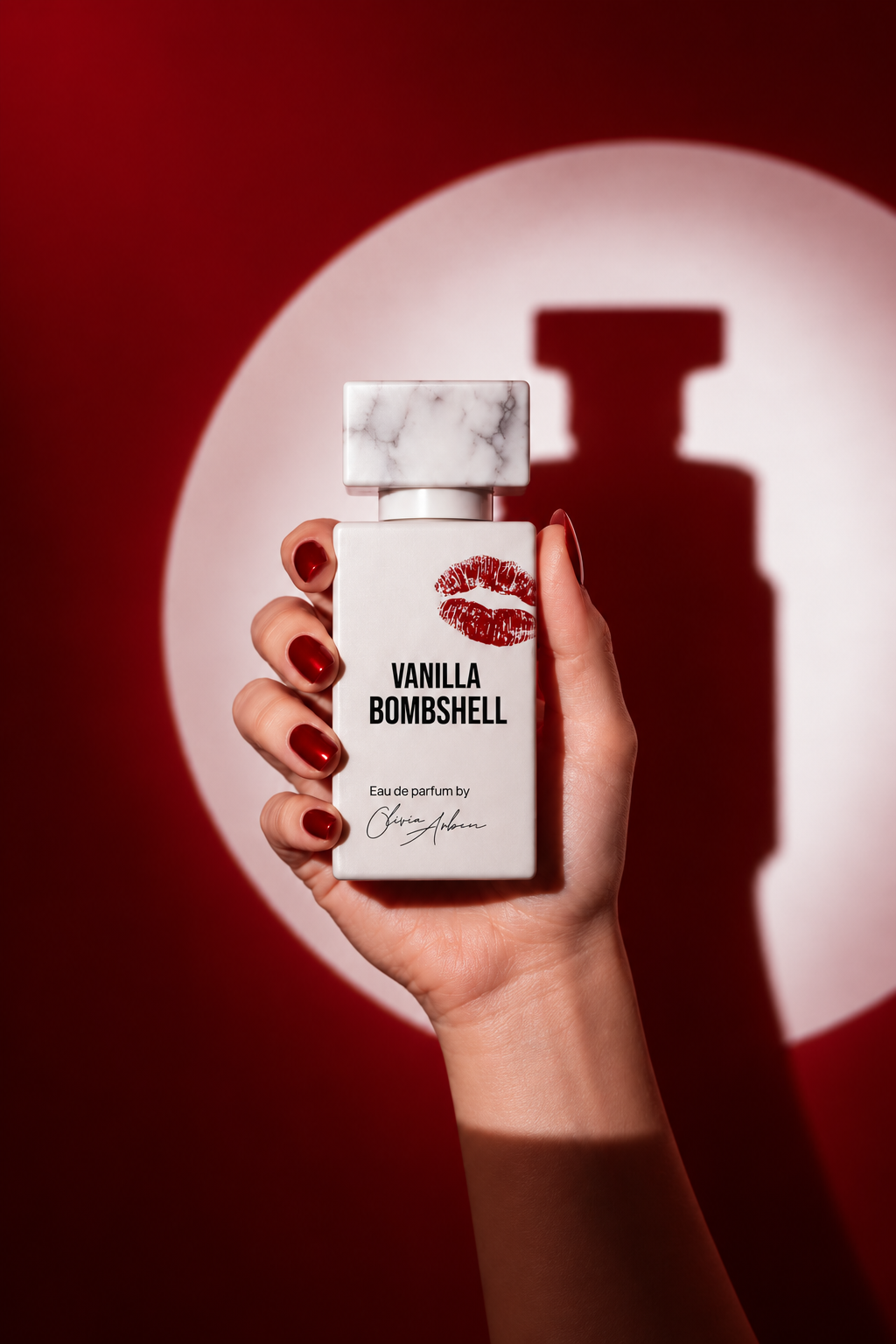
The redesign kept the recognisable idea of the original fragrance, but gave it a more confident, distinctive and campaign-ready identity.