

PassEntry
Making digital wallet pass creation simpler.
Information architecture · Interaction design · Platform constraints · UI systems

Role
Product Designer (UX/UI) · June 2025–Present
End-to-end ownership of UX, UI, information architecture and interaction design, collaborating closely with engineering and leadership.
Overview
PassEntry's Pass Builder enables businesses to create and manage digital wallet passes across Apple and Google Wallet.
I led an end-to-end redesign to simplify complex workflows, improve usability and establish a more intuitive, cohesive interface without compromising the platform's flexibility.
Outcome
Reduced support demand, strengthened the sales experience and supported enterprise growth — transforming a complex builder into a more intuitive, scalable product that reinforces PassEntry's market position.

PROJECT OVERVIEW
One product. Three design challenges.
01 / NAVIGATION
Restructuring complex configuration flows to make the builder easier to navigate without sacrificing flexibility.
02 / FEATURES & INTERACTIONS
Refining everyday workflows, from field management to geofencing, to make advanced functionality more intuitive.
03 / PLATFORM PARITY
Balancing a consistent creation experience with the distinct capabilities and technical requirements of Apple and Google Wallet.

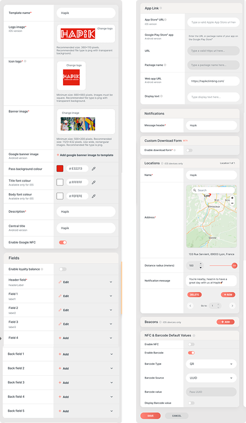
Legacy builder
THE CHALLENGE
More than a visual refresh
The project began with a broad request to modernise the Pass Builder's UI. However, reviewing the existing experience revealed deeper usability challenges: fragmented navigation, inconsistent interactions and an increasingly complex configuration process.
Businesses needed access to powerful, platform-specific functionality, but the interface made everyday tasks harder than necessary.
The challenge was to reduce complexity without limiting capability — turning an ambiguous visual brief into a more considered redesign of the overall experience.
DISCOVERY & STRATEGY
Turning ambiguity into direction
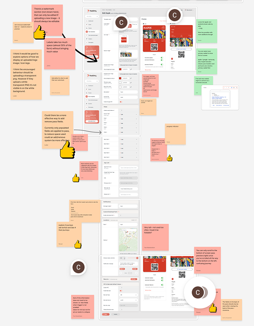
Rather than jumping straight into visual exploration, I introduced a structured design brief and facilitated a cross-functional workshop to align stakeholders on the problems worth solving.
Combining existing customer feedback with a UX audit, I mapped key friction points, challenged assumptions and identified opportunities across navigation, configuration and platform-specific workflows.
This helped establish a shared direction: prioritise clarity and usability while preserving the flexibility required by more advanced users.
How do you make a sophisticated cross-platform builder easier to use without sacrificing the advanced functionality that makes it valuable?
DESIGN EXPLORATION
Finding the balance between
simplicity and flexibility
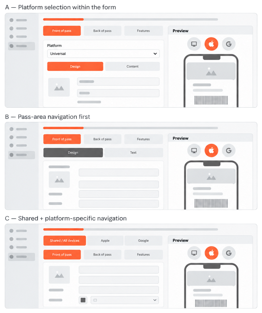
The challenge was balancing simplicity with the flexibility required by two distinct wallet platforms.
I explored navigation structures, configuration groupings and preview layouts, weighing the efficiency of a unified experience against the control of separate workflows.
The chosen direction combined shared settings with platform-specific controls, reducing duplication without compromising advanced functionality.
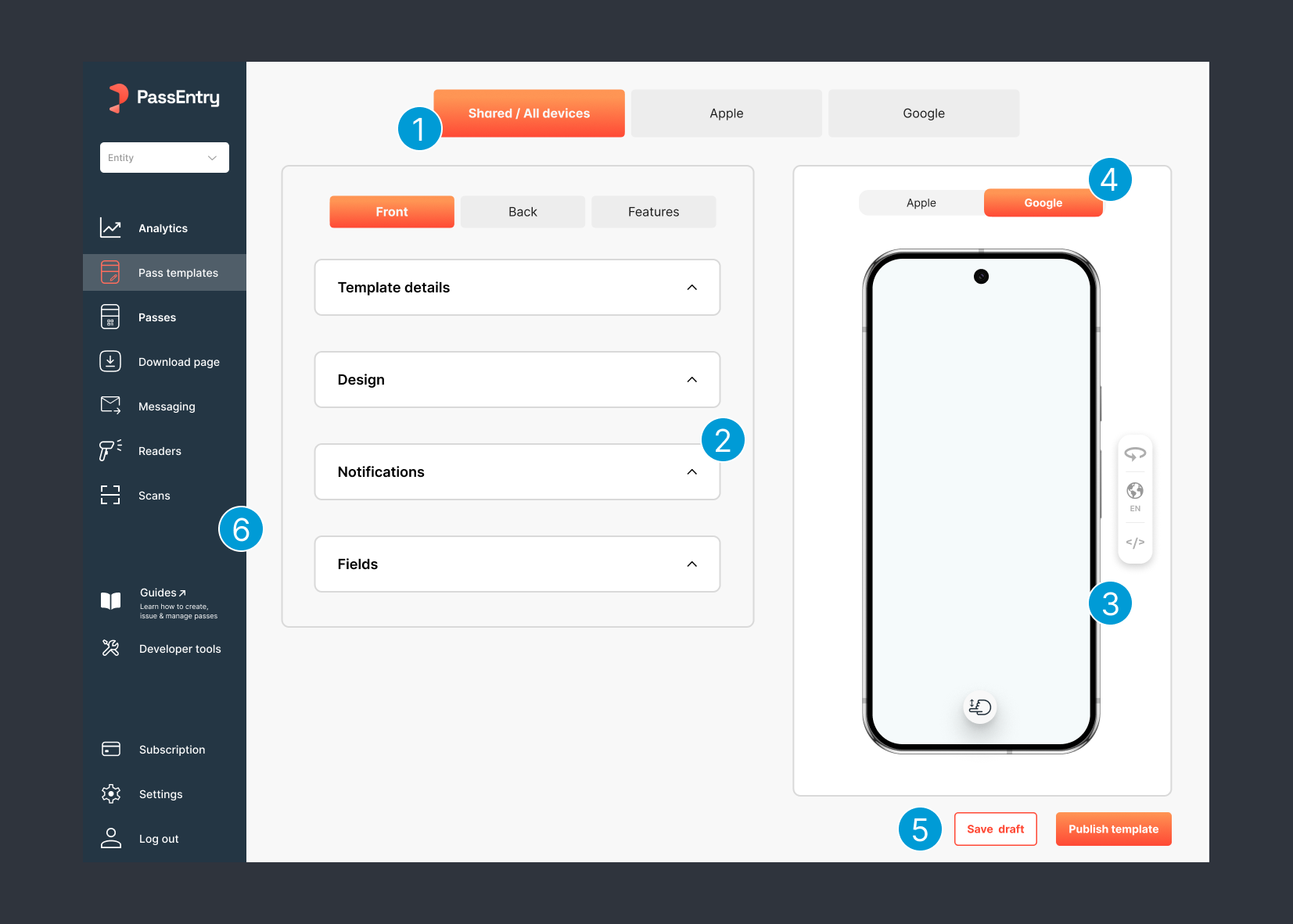
01 — Split navigation
Separated shared and platform-specific settings, reducing duplication and simplifying navigation.
02 — Progressive disclosure
Introduced collapsible sections to reduce visual complexity while preserving advanced controls.
03 — Interactive device preview
Replaced static previews with realistic, interactive passes and contextual display controls.
04 — Platform-specific previews
Decoupled previews from the editor, enabling independent platform switching and future expansion.
05 — Persistent actions
Made Save Draft and Publish accessible throughout the workflow, eliminating unnecessary scrolling.
06 — Streamlined sidebar
Restructured navigation around key workflows, improving clarity and discoverability
02.5/ DESIGN DECISIONS
Simplifying the workflow,
not the functionality.
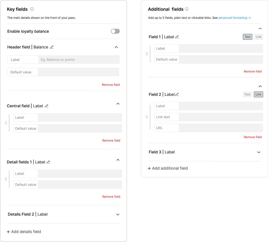
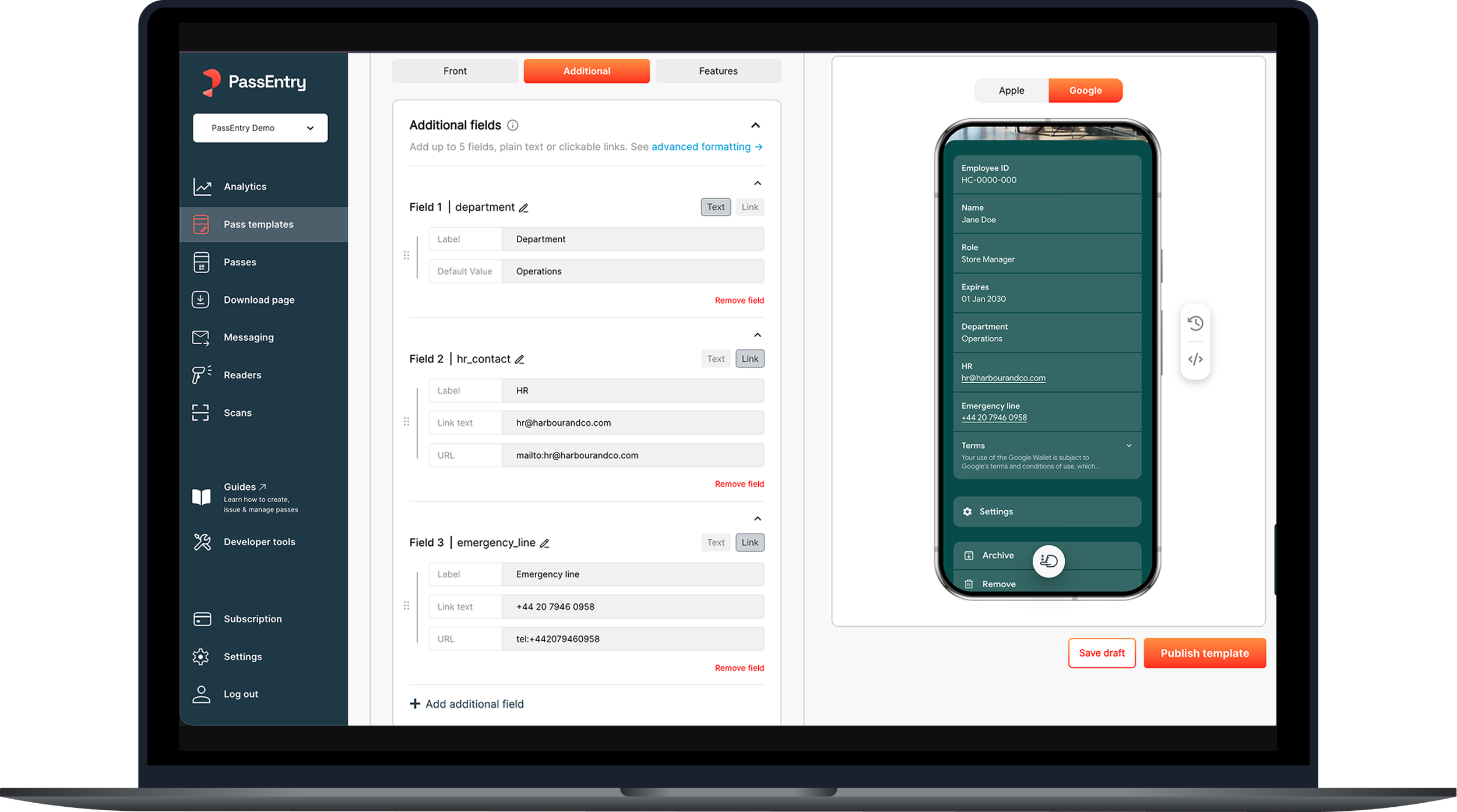
01 — Simplified default-value overrides
Clarified how changes apply to existing passes, reducing related support requests.
02 — Drag-and-drop reordering
Replaced cumbersome configuration steps with direct field reordering.
03 — Clearer field functionality
Introduced explicit Text and Link options, removing ambiguity for non-technical users.
04 — Removed manual field IDs
Eliminated technical identifiers from the workflow, reducing unnecessary decisions.
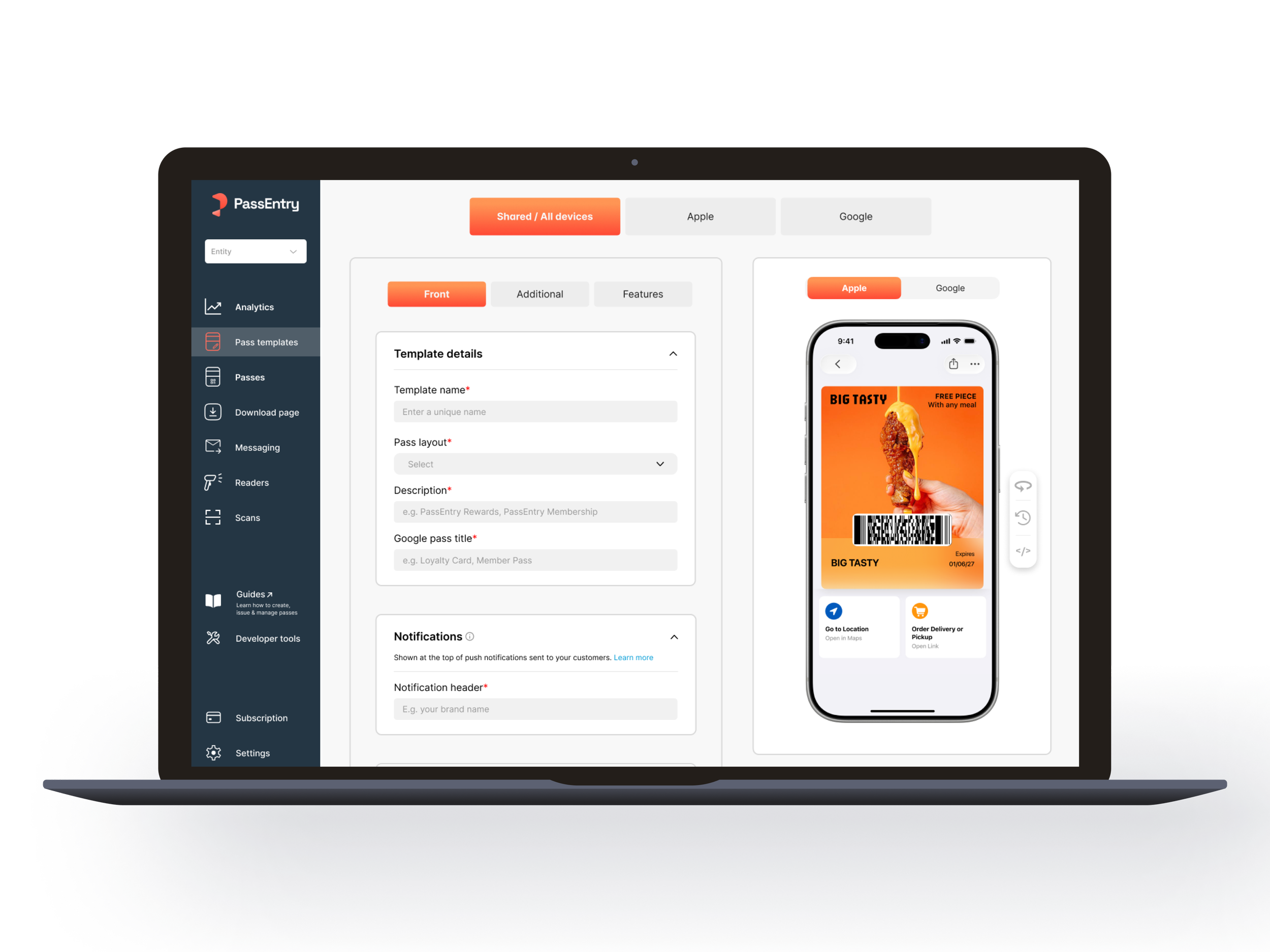
Modern builder
BEFORE & AFTER
A clearer experience, built around the user
From fragmented navigation and dense configuration panels to a more structured, intuitive workspace — bringing clarity to complex tasks while preserving the flexibility of the platform.
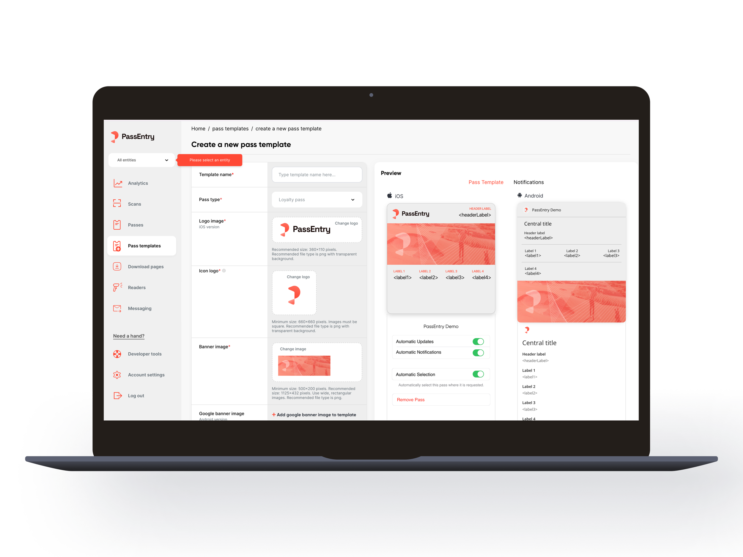
Legacy builder

CHAPTER 02 / FEATURES & INTERACTIONS
Beyond the navigation.
Refining the everyday interactions that make complex features easier to use.
02/ THE PROBLEM
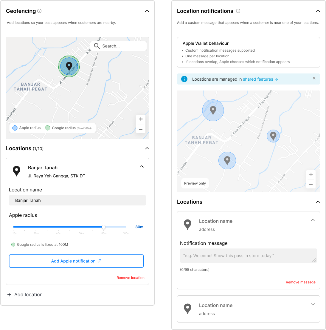
The original geofencing experience treated each location separately, forcing users to navigate between screens without a clear view of their overall setup.
This made it difficult to manage multiple locations, understand overlapping coverage and distinguish between Apple and Google Wallet behaviour.
Rethinking location management
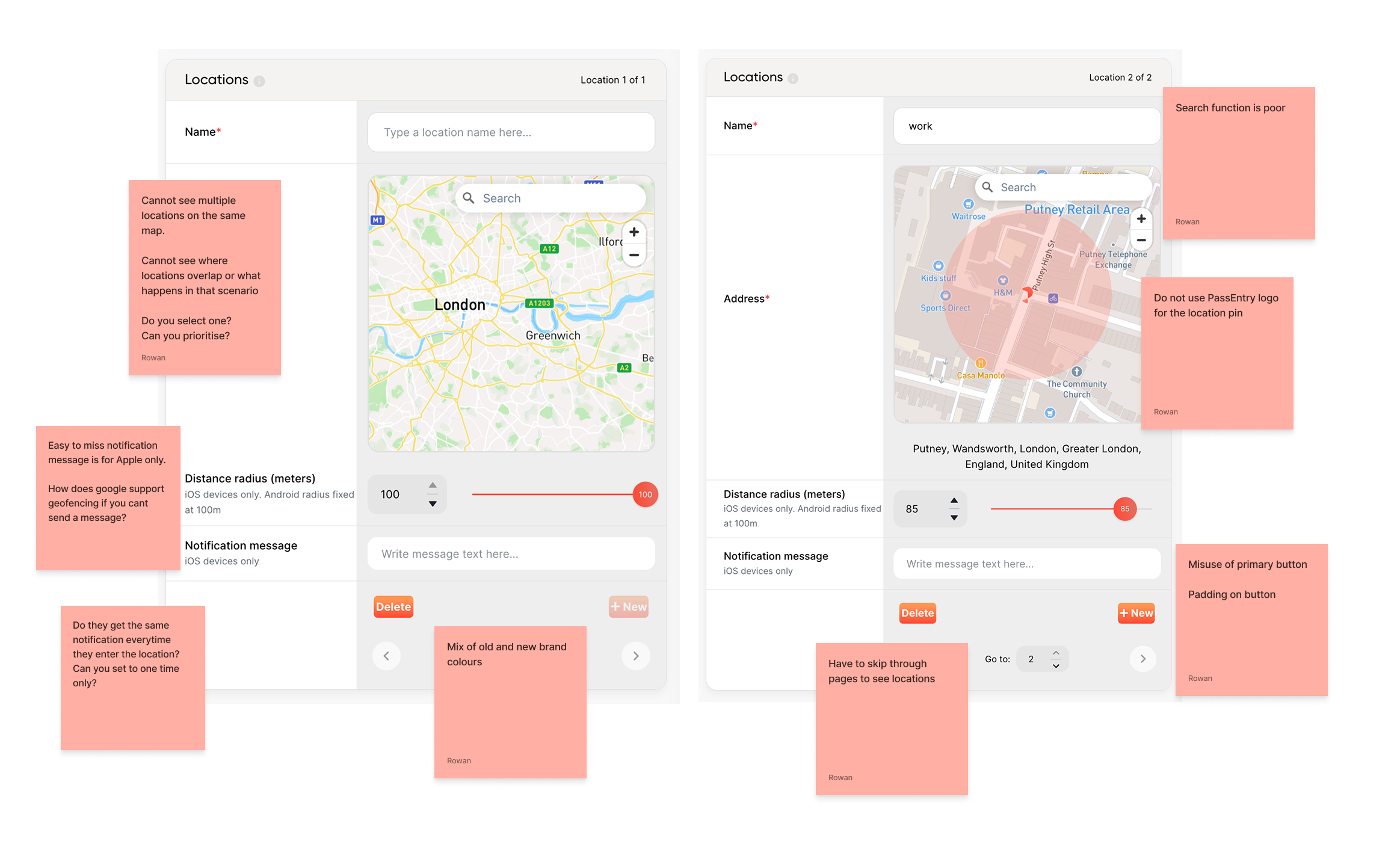
02/ DESIGN ITERATION & TRADE-OFFS
When consistency creates friction
My initial approach kept Apple-specific notifications within the Apple settings, following the wider builder's platform-based navigation.
During design critique, feedback highlighted a problem: users would need to leave the location workflow to complete their notification setup.
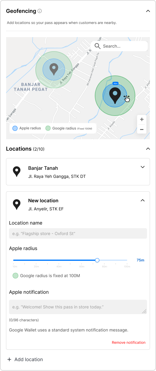
I reconsidered the decision and brought the notification field directly into each location card, using contextual guidance to explain the platform differences.
The takeaway: Consistency is important, but it shouldn't come at the expense of usability.
02/ DESIGN STRATEGY
One map, one connected workflow
I redesigned geofencing around a single interactive map, bringing all locations and their coverage into one unified view.
Improved address search, click-to-place pins and expandable location cards streamlined setup and management, while automatic map focus made navigating multiple locations easier.
Distinct coverage indicators, adjustable Apple radii and contextual guidance clarified platform differences, giving users greater visibility and control.
“It's much easier to understand where all the geofences are, I'm really enjoying playing around with the new template builder.”
— Enterprise client
02.5 / FIELD CONFIGURATION
Making complex configuration feel simple
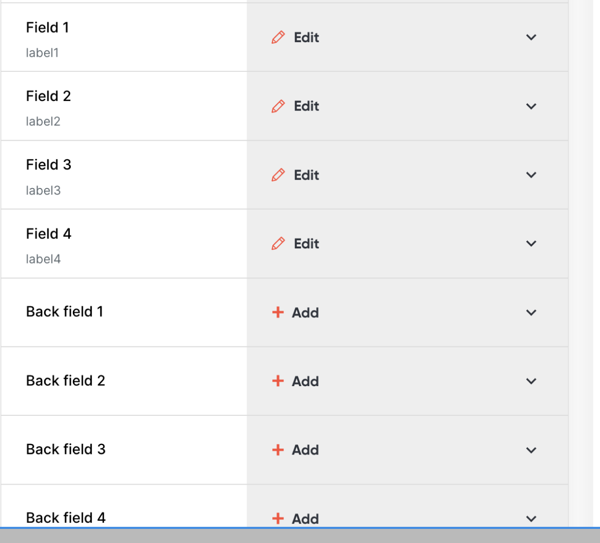
The original field editor required users to navigate fixed field structures, manually manage technical IDs and repeat configuration steps for relatively simple changes.
This created unnecessary complexity for non-technical users and made editing, organising and updating pass content more time-consuming than it needed to be.
02.5/ DESIGN DECISIONS
Simplifying the workflow,
not the functionality.
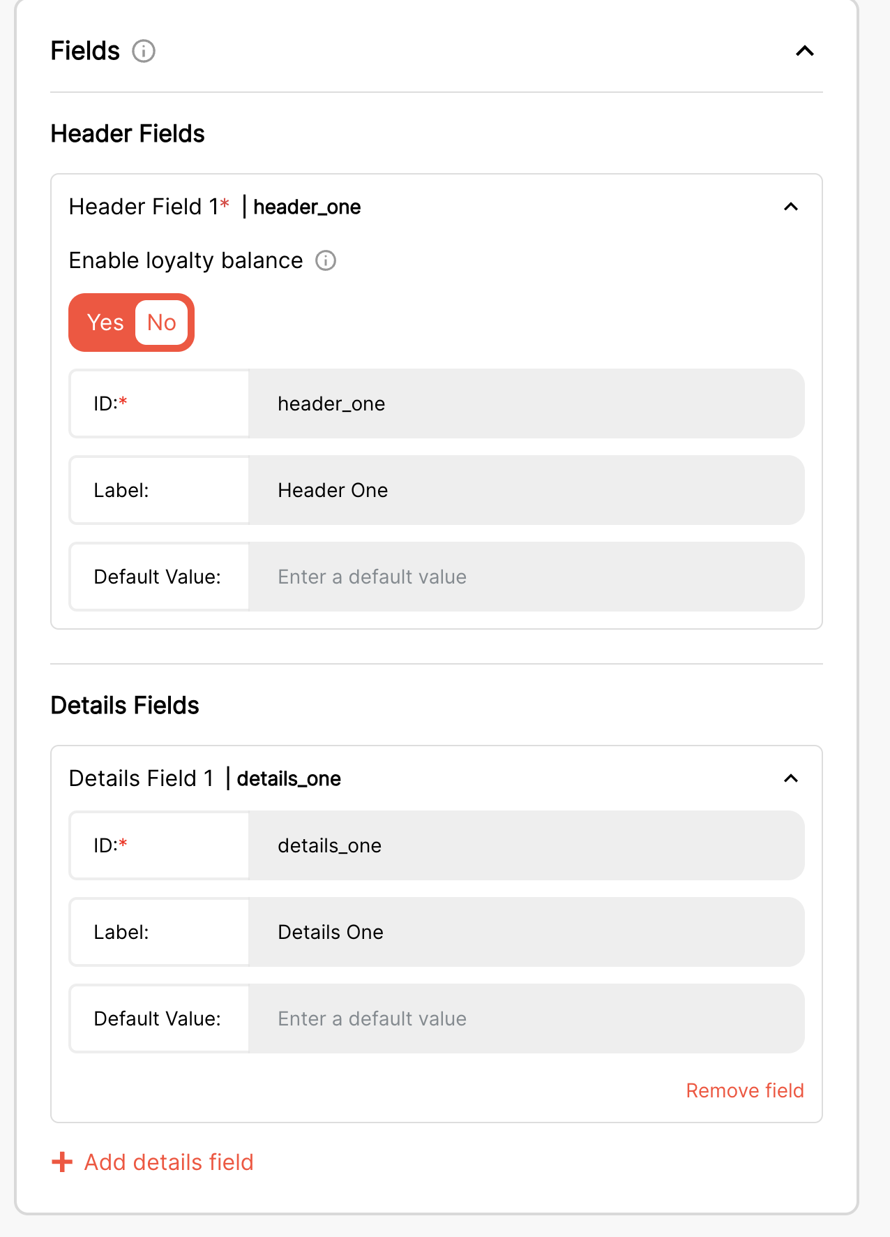
01 — Simplified default-value overrides
Clarified how changes apply to existing passes, reducing related support requests.
02 — Drag-and-drop reordering
Replaced cumbersome configuration steps with direct field reordering.
03 — Clearer field functionality
Introduced explicit Text and Link options, removing ambiguity for non-technical users.
04 — Removed manual field IDs
Eliminated technical identifiers from the workflow, reducing unnecessary decisions.
02.5/ OUTCOME
Less friction. Faster creation.
Reduced support tickets
Simplifying field configuration reduced support requests related to default-value overrides, addressing a recurring source of customer frustration.
Reduced build time
Removing manual IDs, introducing drag-and-drop reordering and clarifying field functionality also streamlined the creation process, reducing the steps and time required to build and edit templates.

CHAPTER 03 / PLATFORM PARITY
One builder. Two moving targets.
Adapting to major Apple and Google Wallet redesigns while preserving a consistent creation experience for existing customers.
Apple
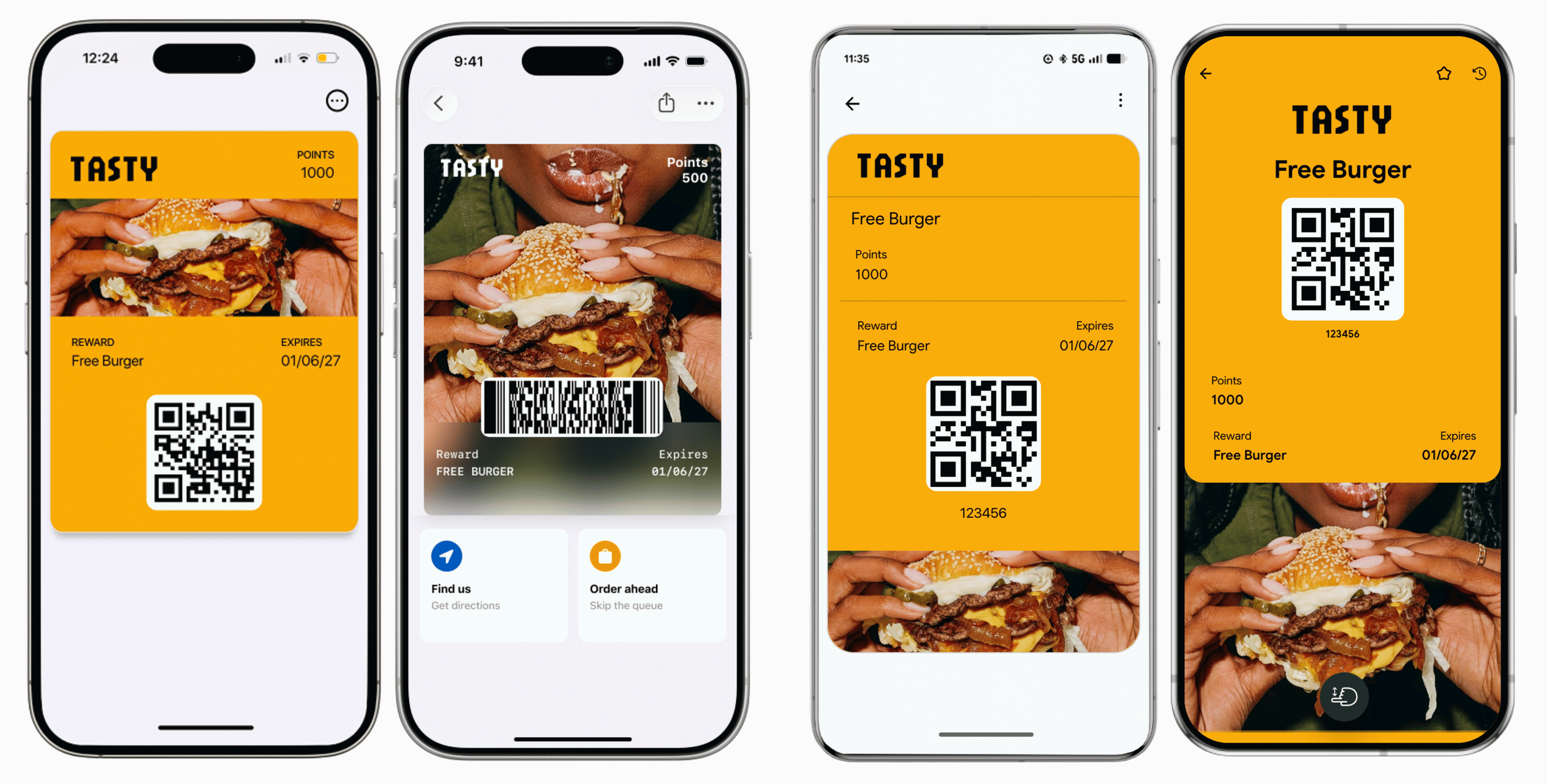
In September, Apple and Google introduced significant Wallet redesigns, bringing new layouts, richer branding and interactive capabilities.
With parts of the functionality still in beta or undocumented, I had to interpret evolving platform requirements and adapt the existing Pass Builder without disrupting established workflows.
The challenge was to introduce new capabilities while maintaining compatibility with existing passes and a cohesive experience across both platforms.
03/ THE CHALLENGE
Designing for what wasn't documented.
03/ RESEARCH AND COLLABORATION
Working without a blueprint.
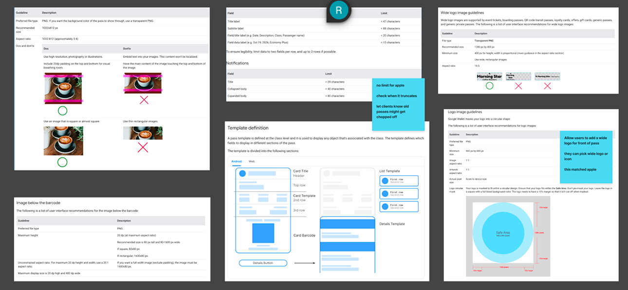
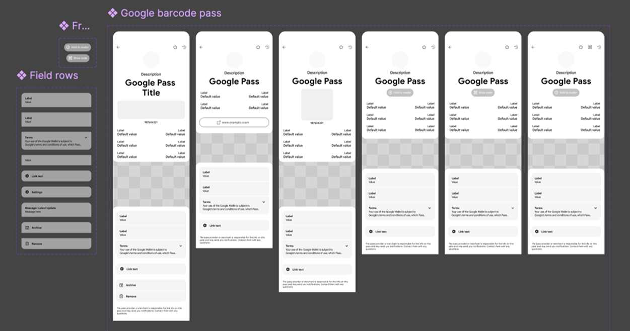
With limited documentation and no complete design specifications, I audited existing passes, investigated emerging platform requirements and designed the new preview states from scratch.
Working closely with engineering and directly with Google, I translated evolving technical constraints into accurate visual representations and practical design requirements.
This helped establish a clearer foundation for introducing new capabilities without disrupting existing workflows.
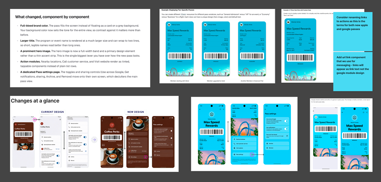
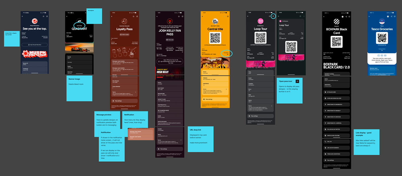
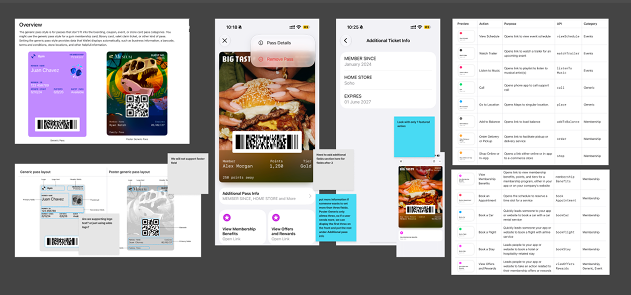
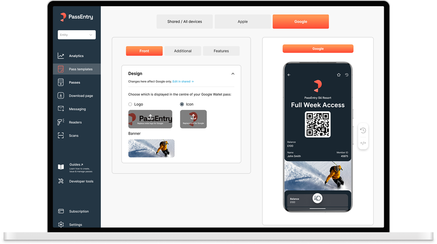
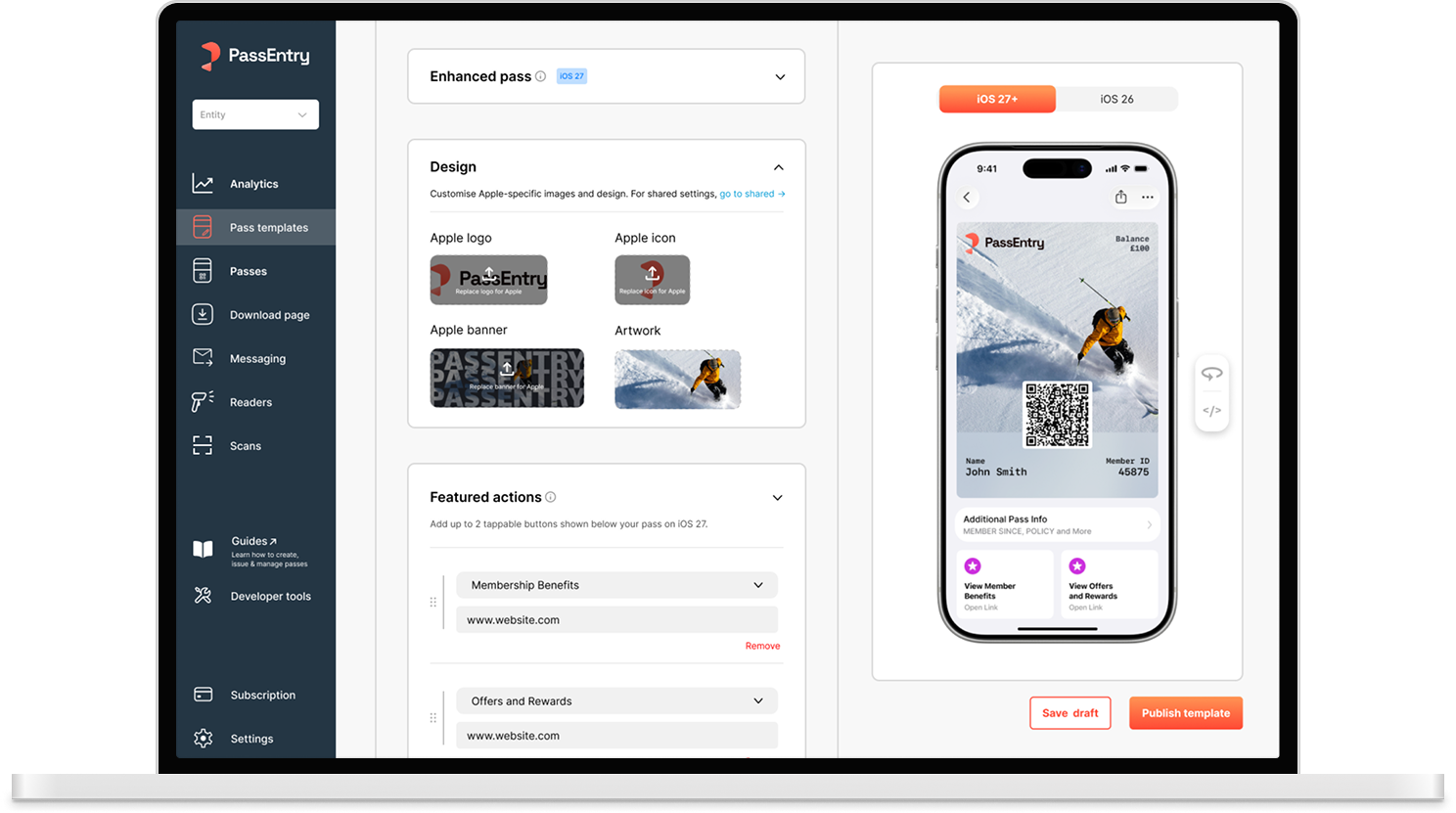
Rather than rebuilding the experience around each platform update, I extended the existing builder structure with contextual, platform-specific controls.
For Apple, this meant supporting enhanced passes with full-bleed artwork, featured actions and previews for different iOS versions.
For Google, I adapted the experience to its new continuous-scroll layout, richer imagery and flexible logo or icon placement.
These changes gave users access to new capabilities without requiring them to relearn how to build a pass.
03/ DESIGNING THE SOLUTION
New capabilities. Familiar foundations.
03/ PRODUCT ADOPTION
Helping customers navigate change.
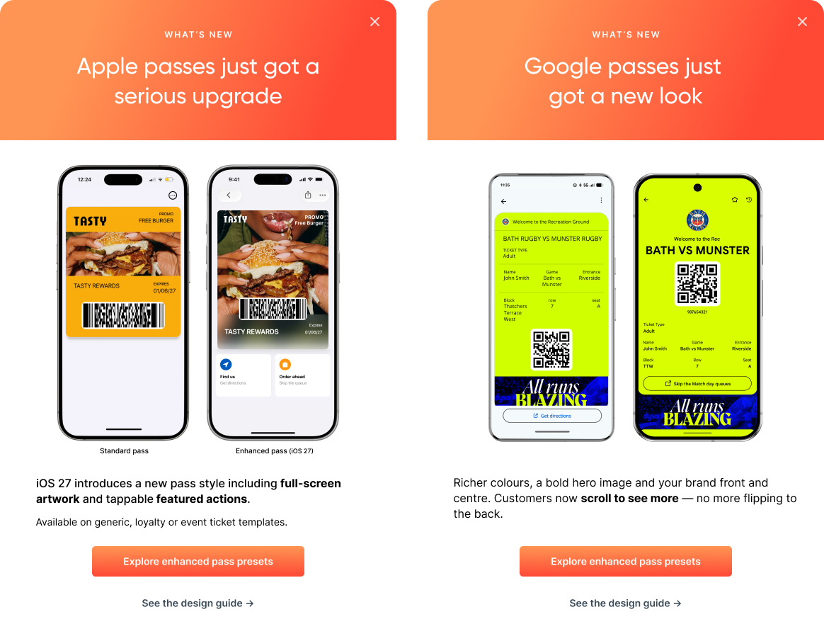
Supporting the new designs was only part of the challenge. Existing customers also needed to understand what had changed and how to take advantage of the new capabilities.
I designed in-product announcements that compared the previous and updated wallet experiences, highlighting new functionality and directing users towards relevant guidance.
03/ OUTCOME
Business-critical design. Delivered on time.
With enterprise clients eagerly awaiting the new Wallet capabilities, delivering a high-quality experience in time for the platform releases was a business priority.
Working closely with engineering, we delivered support for both redesigns on schedule, meeting customer expectations while reinforcing PassEntry's position as a leading digital wallet platform.